
Designing for Clarity: Translating Complex Science into Human Understanding
Healthcare and biotechnology are built on complex ideas.
But the success of those ideas often depends on something much simpler:
Whether people can understand them.
Patients, clinicians, investors, and partners all engage with scientific information differently. When communication breaks down, the impact goes beyond confusion. In healthcare, a lack of clarity can affect decision-making, trust, and ultimately outcomes.
Design plays a critical role in closing that gap.
The Problem: Complexity Without Translation
Scientific organizations are often deeply focused on accuracy, which is essential. But accuracy alone does not guarantee understanding.
In many cases, information is technically correct but cognitively overwhelming. Dense language, fragmented visuals, and inconsistent communication systems create friction for the people trying to engage with it.
Design is often brought in late in the process to “clean things up.”
But clarity cannot be layered on at the end. It must be built into how information is structured from the beginning.
Design as Translation, Not Decoration
At its best, design is not about aesthetics.
It is about translation.
Leading design organizations like IDEO have long framed design as a human-centered discipline—one that starts with understanding how people think, process, and interact with information.
This is especially important in healthcare, where:
• Many audiences are not domain experts
• Time and attention are limited
• Decisions are often high-stakes
Clarity is not achieved by simplifying content alone. It comes from aligning information, structure, and visual language in a way that makes meaning immediately accessible.
Designing for People, Not Just Information
Organizations like AIGA have consistently emphasized the role of design in shaping how people understand and interact with information.
In healthcare, this means designing not just for accuracy, but for real human contexts:
• A patient trying to understand a diagnosis
• A clinician navigating time-sensitive information
• An investor evaluating a complex technology
The goal is not just to present information, but to make it usable and meaningful.
As explored in Helvetica, modernist typography prioritizes clarity and readability—removing visual noise so information can be understood at a glance.
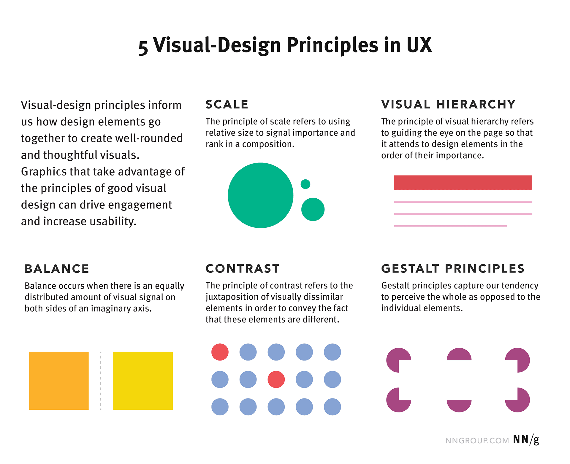
Three Principles for Designing Clarity
1. Simplify Without Losing Meaning
The goal is not to remove complexity, but to organize it.
Clear hierarchy, thoughtful composition, and reduction of unnecessary detail allow people to focus on what matters most—without compromising scientific integrity.
2. Design Systems, Not Just Assets
Modern design practice has shifted toward systems thinking—a perspective widely discussed across organizations like Publicis Sapient and Huge.
In healthcare, information doesn’t live in one place. It exists across:
• Websites
• Presentations
• Patient materials
• Trade show environments
Clarity depends on how these elements work together. A cohesive visual and communication system ensures consistency, which in turn builds trust.
https://www.nngroup.com/articles/principles-visual-design/
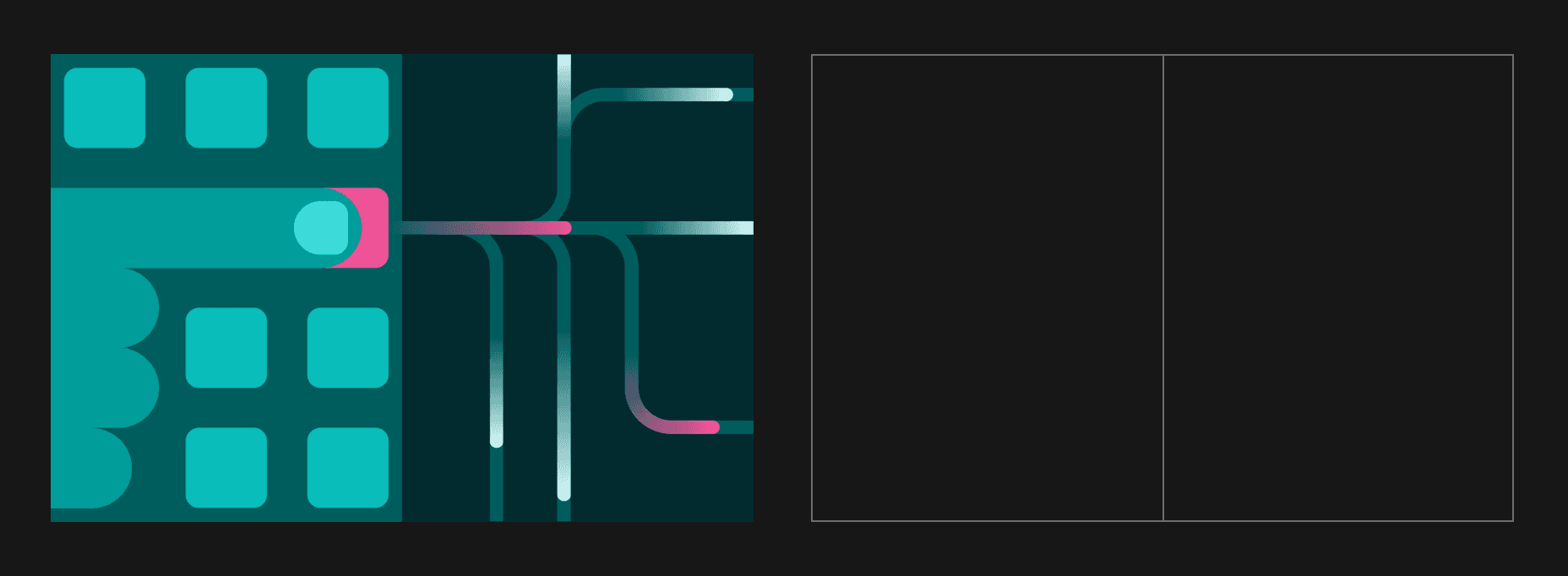
Two sides grid system | https://www.ibm.com/design/language/illustration/tips-and-techniques/
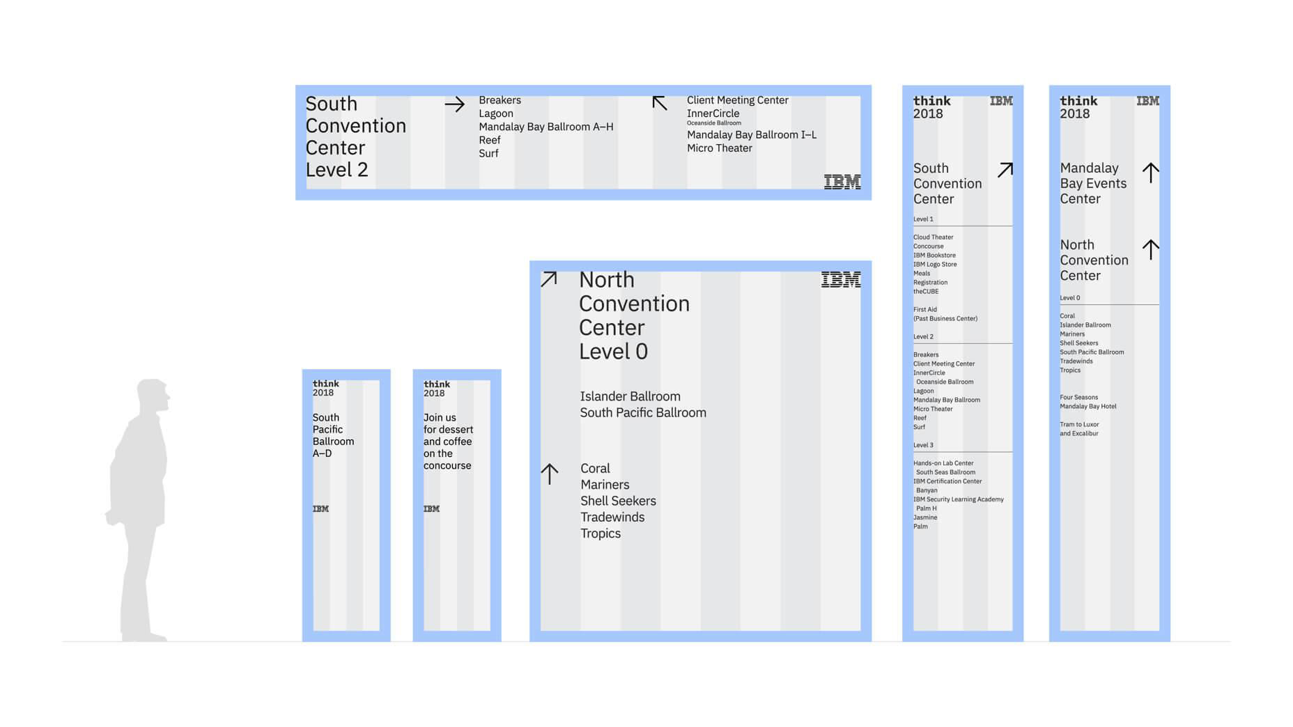
Spatial relationships | https://www.ibm.com/design/event/architecture/signage-wayfinding/
3. Use Visual Storytelling to Bridge Understanding
People understand stories more intuitively than data.
Visual tools—such as diagrams, illustrations, and motion graphics—help translate abstract or invisible processes into something tangible.
Publications like Communication Arts regularly highlight how visual storytelling can elevate complex ideas by making them accessible without oversimplifying them.
In healthcare, this might look like:
• Anatomy illustrations that explain a condition
• Motion graphics that demonstrate how a therapy works
• Visual metaphors that make unfamiliar concepts relatable
A Practical Approach
In my work with healthcare and biotech organizations, the focus is always the same:
How do we make complex ideas understandable without losing their depth?
This often involves:
• Developing a clear and scalable visual language
• Designing systems that extend across digital and physical touchpoints
• Creating motion and illustration frameworks for patient education
• Aligning brand, content, and experience into a cohesive whole
The goal is not just clarity, but confidence—helping people feel that they understand what they are seeing.
Why This Matters
Healthcare is one of the few industries where communication directly impacts outcomes.
When people understand information, they make better decisions. They engage more deeply. They trust more easily.
Clarity is not simply a design preference. It is a functional requirement.
Closing Thought
Design does not reduce complexity.
It reveals structure within it.
And in fields like healthcare and science, that clarity can make all the difference.
References and Further Reading
IDEO – Design Thinking
https://designthinking.ideo.com
https://designthinking.ideo.com
IDEO – Health Practice
https://www.ideo.com/health
https://www.ideo.com/health
Publicis Sapient – Insights
https://www.publicissapient.com/resources/blog
https://www.publicissapient.com/resources/blog
Communication Arts
https://www.commarts.com
https://www.commarts.com
Huge – Thinking
https://hugeinc.com/ideas
https://hugeinc.com/ideas